RANTEX WALL GRAPHICS, WAYFINDING
THE CHALLENGE
To create a cohesive office branding and wayfinding system that reflects Rantex’s identity as a leading denim manufacturer, balancing industrial character with a contemporary, minimal aesthetic.
THE OUTCOME
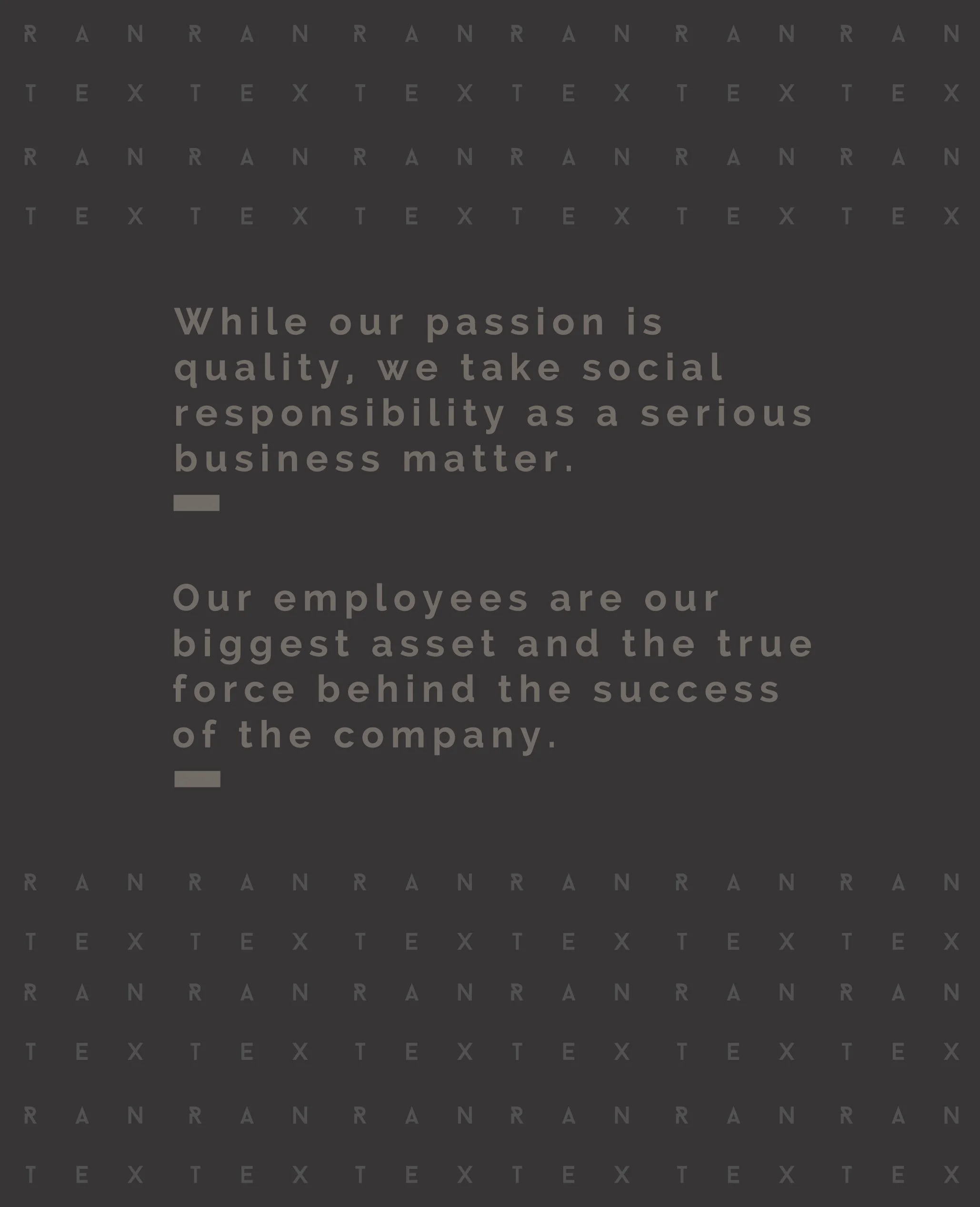
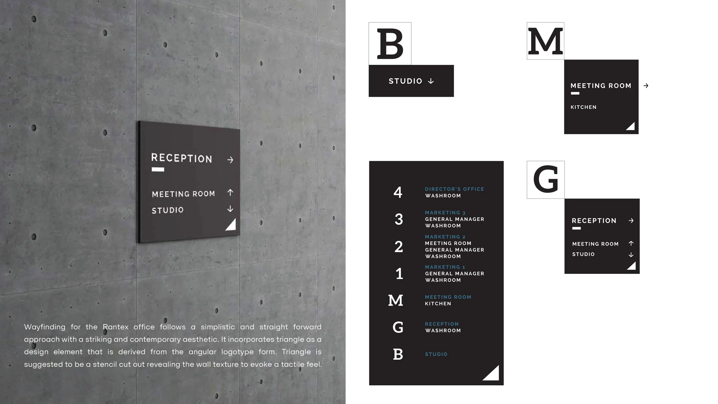
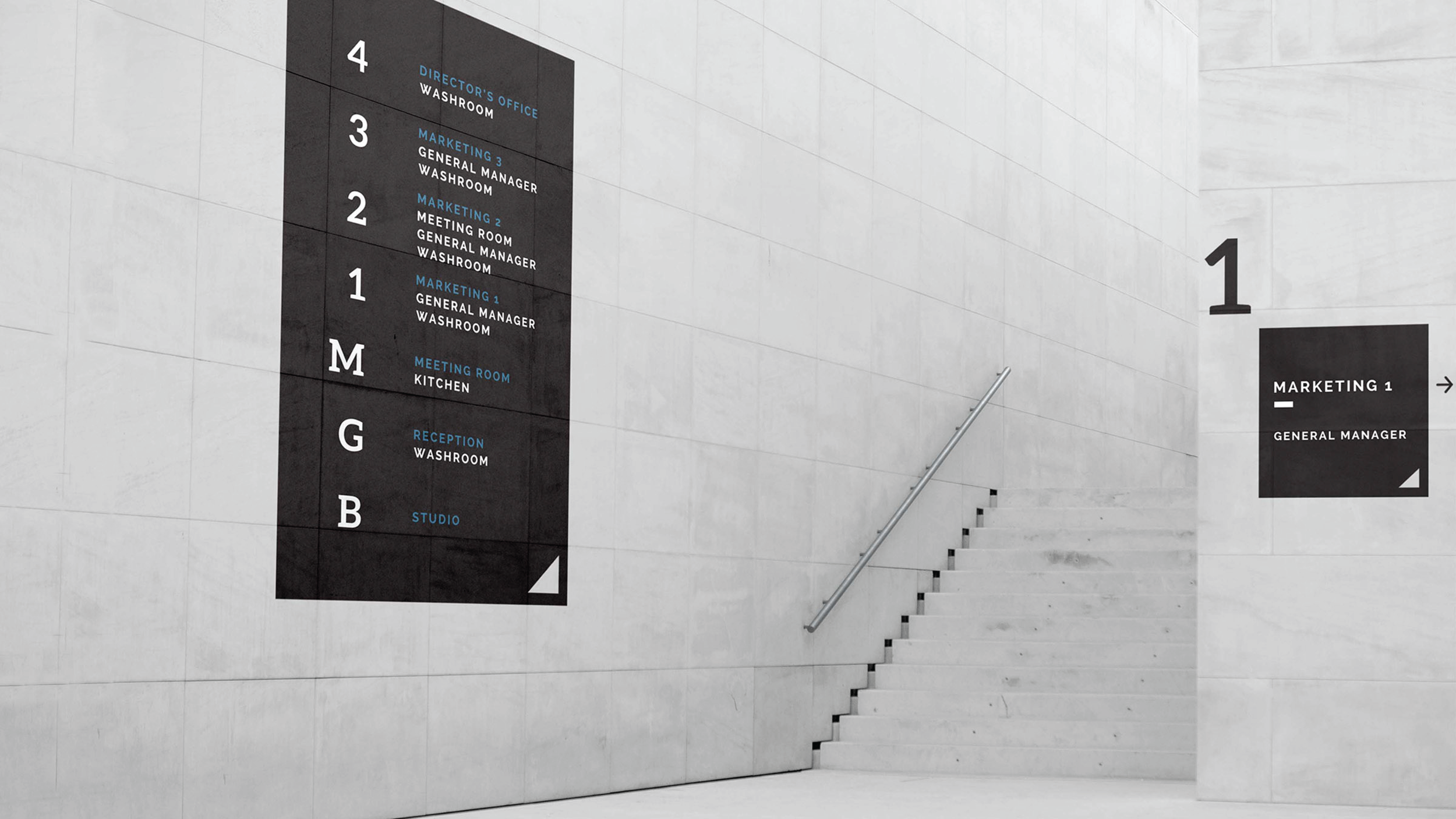
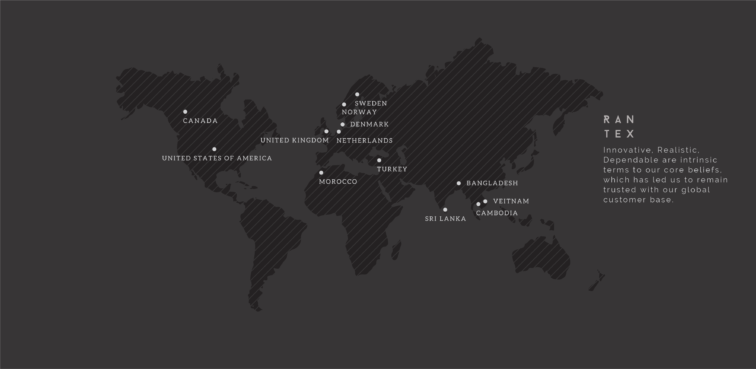
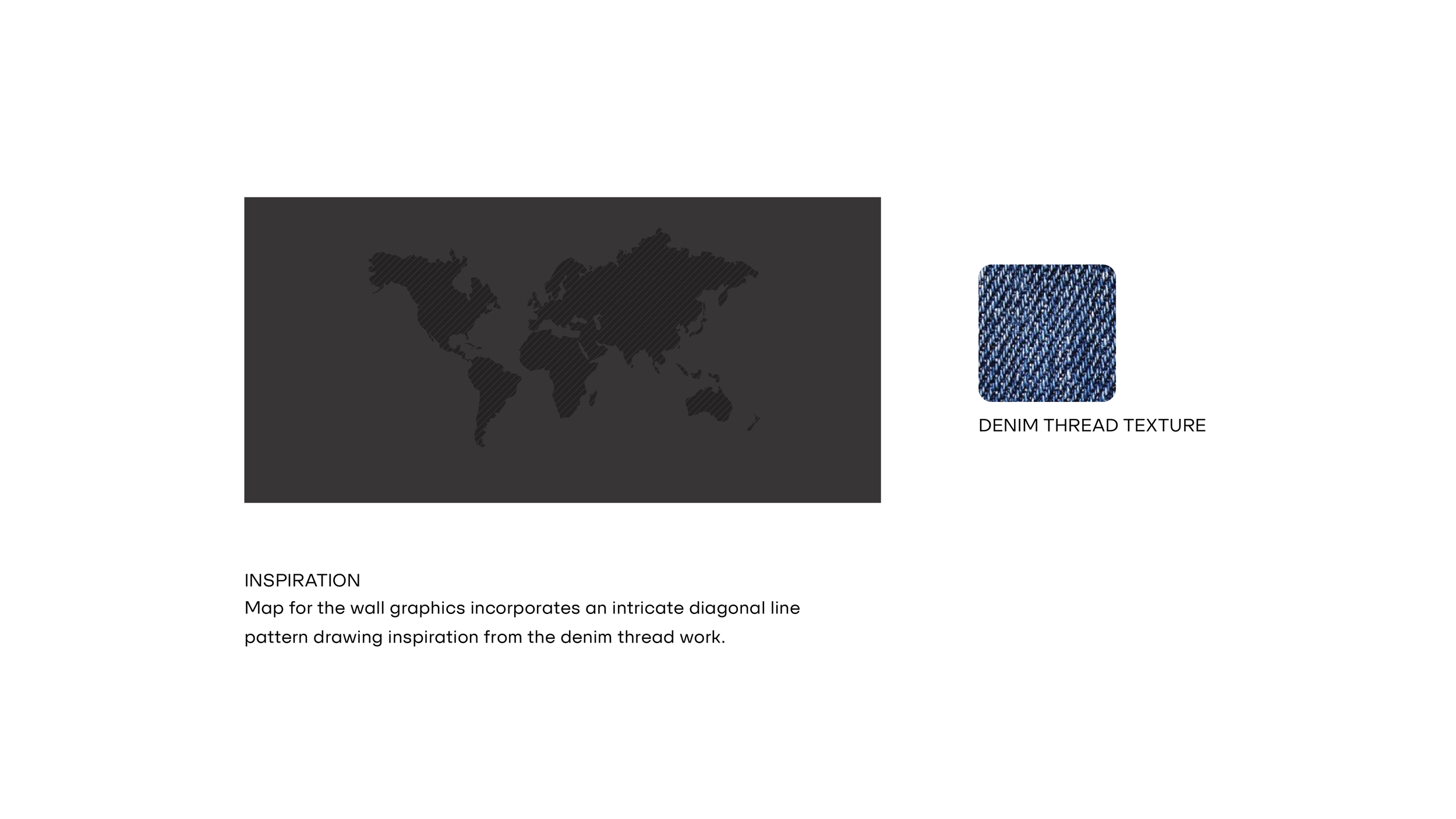
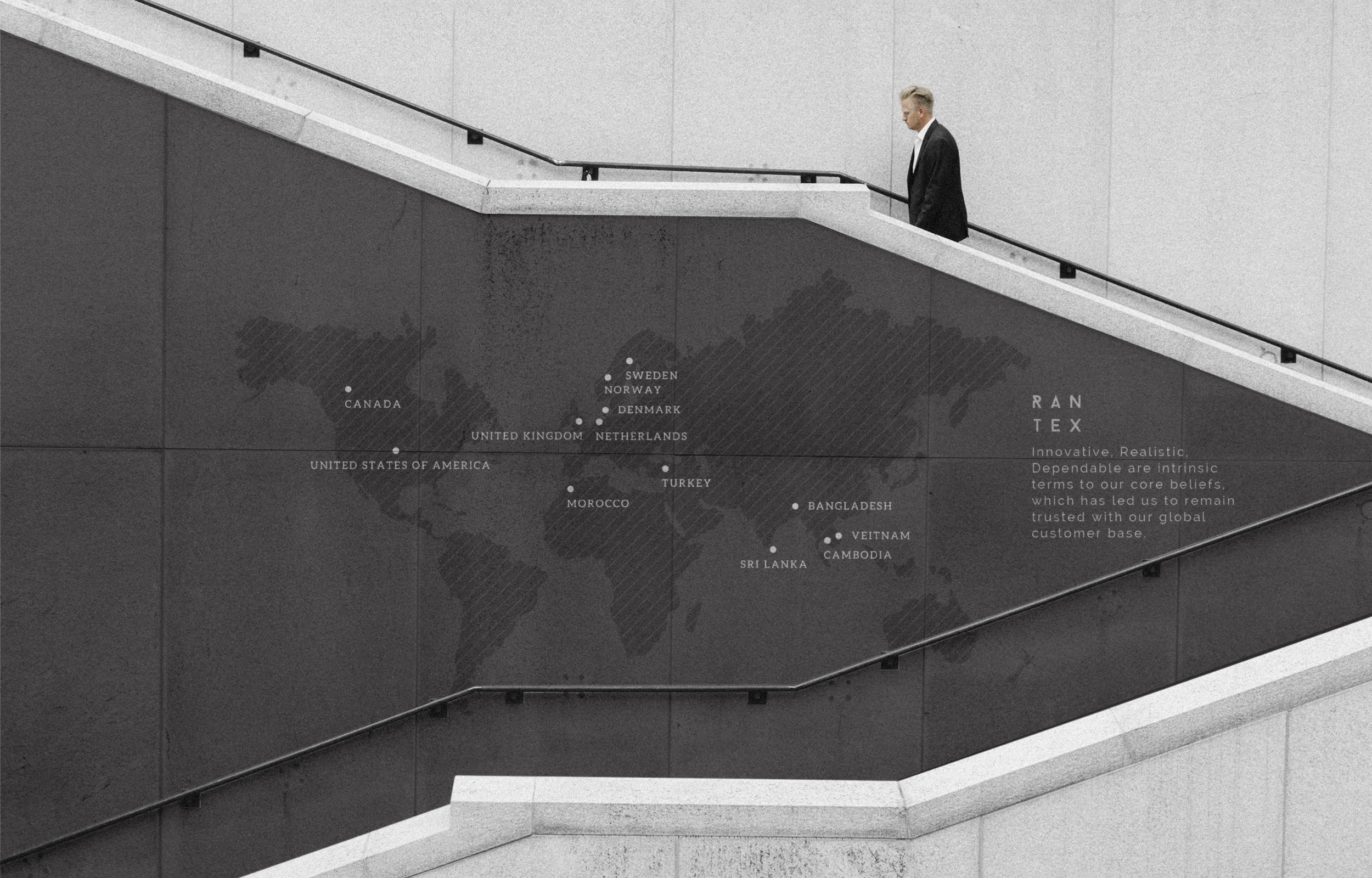
Designed wall graphics and wayfinding for Rantex’s seven-floor office building using a bold, precise, and minimal design language. The typographic system combines Baron and Raleway as primary typefaces with Avenir and Aleo as secondary typefaces, maintaining a strong visual hierarchy. A neutral palette of black and white reinforces the brand’s clarity and confidence. For the meeting room, a custom world map artwork highlights Rantex’s export destinations, featuring diagonal line patterns inspired by denim weave pattern. A Rantex Logo Pattern was developed as a functional graphic element, applied across walls and signage to unify the spatial identity. Bold typographic quotes and the brand’s vision statements activate each floor, turning the office space into a visual expression of Rantex’s craftsmanship and values.
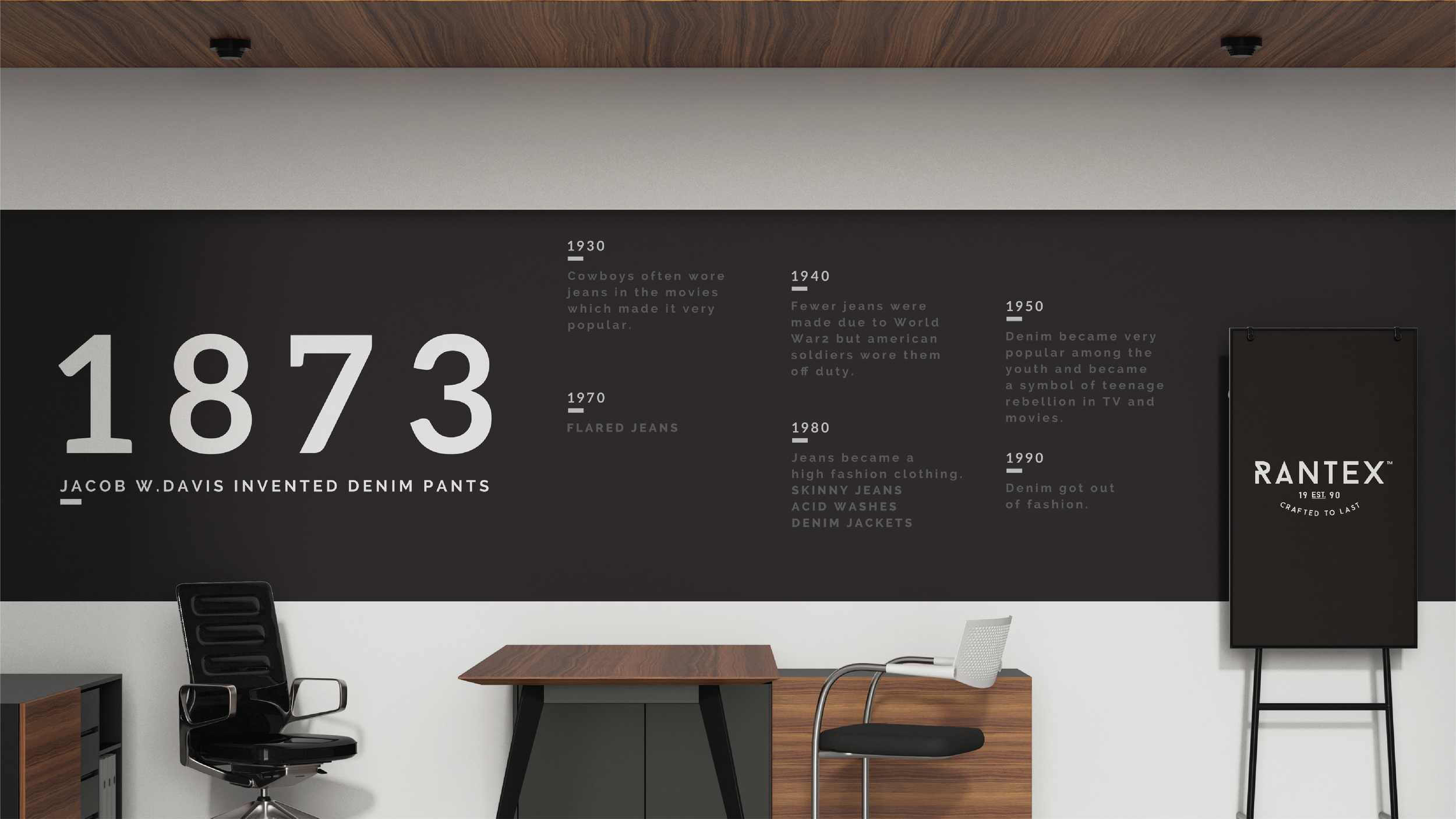
For Rantex Studio Wall Artwork, I created a timeline of the history of denim pants. The overall design language of the office branding is minimal, edgy and follows a bold typographical approach. The bold text in the Studio Wall Artwork is suggested as a stencil cut out revealing the wall texture to evoke a tactile feel.